
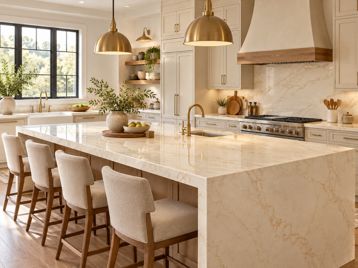
Cream-colored surfaces can make a kitchen feel softer, brighter, and more welcoming without creating the sharp contrast that comes with pure white. When you choose a warm neutral countertop, you create a base that can work with wood cabinets, painted finishes, warm metals, and many flooring styles. Therefore, cream quartz can be a practical choice when you want a kitchen that feels current but still comfortable. Keystone Granite OH works with homeowners who want countertop colors that fit the rest of the kitchen rather than compete with it. If you are planning a remodel in Dublin and Columbus, Ohio, you should look at the cabinet tone, flooring, backsplash, lighting, and hardware before choosing the final surface. That approach helps you create a kitchen where every major material feels connected. Cream quartz also gives you more flexibility than many people expect. Some designs are nearly solid, while others include beige, gold, gray, or soft brown veining. As a result, you can create a quiet traditional kitchen, a warm modern space, or a more organic design without changing the basic countertop color family.
Key Takeaways
- Cream quartz works best when its undertone matches your cabinets, flooring, backsplash, and lighting.
- Warm neutral surfaces can soften the kitchen while still providing enough contrast to define cabinets and islands.
- You should compare full-size samples in your own lighting before making a final countertop decision.
Why Warm Neutral Countertops Work in So Many Kitchens
Warm neutrals are easy to live with because they sit between bright white and deeper beige or brown tones. They can make a room feel light without looking cold. At the same time, they can support natural wood finishes and softer paint colors without making the kitchen feel overly traditional. When you compare cream quartz countertops, pay close attention to the undertone rather than the color name alone. One cream quartz may lean toward ivory, while another may include beige, taupe, gold, or even subtle gray movement. Therefore, you should always compare the actual surface with the materials already planned for the room. A warm neutral countertop also gives you room to change smaller design details later. You can replace cabinet hardware, repaint the walls, change pendant lights, or update furniture without needing to replace the countertop. That long-term flexibility is one reason cream tones continue to work across many kitchen styles.
Understand the Difference Between Cream, Beige, and Warm White
Cream, beige, and warm white are related, but they do not create exactly the same effect. A warm white countertop still looks mostly white, but it has softer yellow, beige, or ivory undertones. Cream usually has a little more warmth and depth. Beige, meanwhile, often appears slightly darker and may contain more tan or brown. Those differences matter because the countertop has to work with the cabinets. For example, a cool white cabinet may make a yellow-leaning cream surface look warmer than expected. However, the same countertop may look completely natural beside oak cabinetry. You should also compare the countertop with the backsplash. If both materials contain warm tones, the room can feel balanced. However, a very cool backsplash beside a strongly warm countertop may create a color mismatch.
Match Cream Quartz With White Cabinets Carefully
White cabinets and cream quartz can work very well together, but the undertones need to be compatible. If the cabinets are a warm white, cream quartz can create a soft, layered look. The countertop will provide enough difference to keep the room from feeling flat while still maintaining a light overall palette. However, if the cabinets are a crisp blue-white, some cream surfaces may look too yellow beside them. Therefore, you should always place the cabinet sample directly next to the quartz. You should also look at the room in both daylight and evening light. Warm bulbs can make cream quartz appear richer, while strong daylight may reveal gray or beige details that were less noticeable in a showroom.
Pair Cream Quartz With Natural Wood Cabinets
Natural wood and cream quartz are one of the easiest combinations to balance. Light oak can create a soft, organic look when paired with a warm cream surface. The countertop keeps the kitchen bright, while the wood adds texture and natural color. Medium or darker woods can also work well. For example, walnut cabinets can create stronger contrast while the cream quartz prevents the room from becoming too dark. The main goal is to repeat warmth across the kitchen. If the cabinets have golden or reddish tones, a quartz surface with a gentle warm undertone can help the materials feel connected. In Dublin and Columbus, Ohio, this type of combination can work well in both newer kitchens and homes where you want to update the space without losing a comfortable residential feel.
Use Cream Quartz With Painted Cabinets
Cream quartz is not limited to white or wood cabinetry.
Soft green cabinets can pair naturally with warm neutral countertops because both colors often feel connected to organic materials. Muted blue can also work, especially when the quartz contains gentle gray or beige movement. Greige cabinets create a more subtle combination. Because greige already sits between gray and beige, cream quartz can reinforce the warmer side of the color without creating too much contrast. Dark cabinets can create a very different effect. Navy, charcoal, deep green, and black cabinetry can all look strong beside cream quartz. In this case, the light countertop helps prevent the room from feeling too heavy.
Decide How Much Veining You Want
Cream quartz is available with very little pattern or with bold veining. A quieter surface can work well when the kitchen already contains several detailed finishes. For example, if the backsplash has pattern and the cabinets have visible wood grain, a simple countertop can create balance. On the other hand, a stronger vein can become an important design feature. This works especially well on large islands because the surface area gives the pattern room to appear naturally. You should think about the size of the kitchen as well. Large, dramatic movement can feel impressive in an open layout, while smaller kitchens may benefit from softer patterns. The goal is not to avoid pattern. Instead, you should decide where you want the visual attention to go.
Think About the Kitchen Island Separately
Your island can either match the perimeter countertops or create contrast. Using the same cream quartz throughout the kitchen can make the room feel calm and connected. This approach works particularly well in open layouts because the repeated material creates visual continuity. However, you can also use cream quartz only on the island and choose another surface elsewhere. In that case, the island becomes a stronger design feature. You should still keep the materials related through color or undertone. For example, a warm cream island can work with darker perimeter counters if both surfaces share subtle beige or gold details. You should also think about the edge profile. A thicker or waterfall edge can make a cream quartz island feel more substantial without relying on a darker color.
Coordinate the Backsplash With the Countertop
The backsplash and countertop sit next to each other, so they should be planned together. If the cream quartz contains noticeable veining, a simple backsplash can keep the design from feeling too busy. Plain tile, lightly textured surfaces, or a matching neutral tone can work well. If the quartz is mostly solid, you have more freedom to use pattern on the wall. You can also continue the same quartz up the backsplash. This creates a more continuous look and can make the kitchen feel cleaner and more modern. However, you should always compare the materials before installation. Two surfaces described as cream may have very different undertones once they are placed together.
Consider Flooring Before Finalizing the Quartz
Flooring can change how cream quartz looks. Warm wood floors usually work naturally with cream because both materials share similar undertones. However, the exact depth of the wood still matters. Cool gray flooring can be more difficult. If the quartz is very warm, the difference between the floor and countertop may feel too strong. You do not need every material to match. In fact, a little contrast can make the kitchen more interesting. However, the colors should still feel intentional. If the floor contains several tones, look for one of those tones in the quartz. That small connection can help the room feel more unified.
Use Lighting to Judge the Real Color
Lighting can change cream quartz significantly. Natural daylight may make the surface look lighter and more neutral. Warm artificial light may bring out beige or gold tones. Meanwhile, cooler bulbs may make the same surface appear slightly grayer. Therefore, you should never choose the countertop under showroom lighting alone. Bring a sample into the kitchen if possible. Place it near the cabinets, flooring, backsplash, and wall color. Then check it at different times of the day. This is especially important if the room has limited natural light. In a darker kitchen, a cream surface may appear deeper than it does in a bright showroom.
Think About Daily Maintenance
Quartz is often chosen because it supports relatively simple everyday care. You should still wipe spills quickly and clean the surface with products recommended for quartz. However, you usually do not need the same sealing routine associated with many natural stones. Heat protection also matters. You should use trivets or pads under very hot cookware rather than placing pans directly on the countertop. Cutting boards are also useful because they protect both the countertop and your knives. These habits are simple, but they can help keep the surface looking consistent over time.
Decide Whether Cream Fits Your Long-Term Style
Countertops usually stay in place for many years, so you should think beyond current trends. Cream works well because it is neutral without being completely plain. It can support traditional, transitional, modern, and organic interiors depending on the other materials around it. You can also change the mood of the room later. Brass hardware can make the kitchen feel warmer, while black hardware can create more contrast. Natural wood accents can add softness, while polished metal can make the space feel more contemporary. Because the countertop remains neutral, these smaller changes are easier to make without replacing the main surface.
Compare Full Slabs Before Making a Final Choice
Small samples are useful, but they do not always show the complete pattern. A piece of cream quartz may look almost solid in a small sample even though the full slab contains stronger veining. Therefore, viewing a larger piece can help you understand the actual scale of the design. This is especially important for islands, long countertop runs, and waterfall edges. You should also ask how the pattern continues across seams and corners. A good layout can help the finished countertop look more intentional. When comparing quartz countertops in Columbus, look at full-size colors alongside your cabinet and flooring samples rather than choosing from a screen alone. Physical comparison gives you a much clearer idea of how warm or cool the final surface will feel.
Consider the Edge Profile
The edge profile can slightly change the appearance of cream quartz. A straight or eased edge creates a clean look and works well in modern kitchens. A rounded edge feels softer and can complement more traditional cabinetry. More decorative profiles can work too, but they should match the cabinet design. If the cabinets already contain a lot of detail, a simpler countertop edge can provide better balance. You should also think about how thick you want the countertop to appear. Certain edge treatments can make the slab look heavier or more substantial. The edge should support the overall design rather than attract attention away from the stone itself.
Plan for Open-Concept Spaces
Open kitchens need to work with nearby living and dining areas. Cream quartz can help because the color is soft enough to blend with many furniture styles and wall colors. If your kitchen opens into a room with warm wood floors, neutral furniture, or natural textures, cream quartz can help maintain visual continuity. You should also consider how the countertop looks from across the room. A dramatic vein may become more noticeable from a distance, while a quieter cream surface may create a calmer backdrop. This matters because the kitchen becomes part of the larger living space rather than a separate room.
Avoid Making the Kitchen Too Monochromatic
A cream countertop can create warmth, but too many similar tones may make the room feel flat. You can prevent this by adding contrast through hardware, lighting, cabinet color, flooring, or backsplash. For example, dark bronze or black fixtures can provide definition. Natural wood can add texture. Green plants or warm metal details can add color without changing the neutral foundation. You should aim for layers rather than perfect matching. The countertop, cabinets, and walls can all stay light while still feeling different enough to create depth.
Think About Resale Without Designing Only for Resale
A neutral countertop can appeal to a wide range of people, but you should still design the kitchen for your own daily use. Cream quartz can be a practical middle ground because it feels warmer than bright white but remains flexible enough for many design styles. If you plan to stay in the home for years, your preferences should guide the final choice. However, choosing a balanced neutral can still help the kitchen remain broadly appealing later. This is especially useful in Dublin and Columbus, Ohio, where homes can vary from traditional layouts to newer open-concept designs.
Final Thoughts
Cream quartz can give a kitchen warmth without making it feel dark or overly traditional. Its soft neutral character allows you to pair it with white, wood, green, blue, gray, or darker cabinetry while still maintaining a balanced design. The most important part of choosing the right surface is understanding the undertone. You should compare the quartz with your cabinets, flooring, backsplash, lighting, and hardware before making the final decision. You should also think about pattern size, edge profile, maintenance, and how the surface will look in the entire room rather than judging a small sample by itself. When these details work together, cream quartz can create a kitchen that feels comfortable, flexible, and visually connected. It gives you enough warmth to avoid a cold appearance while still providing the clean look many homeowners want from a quartz surface.